Kompass
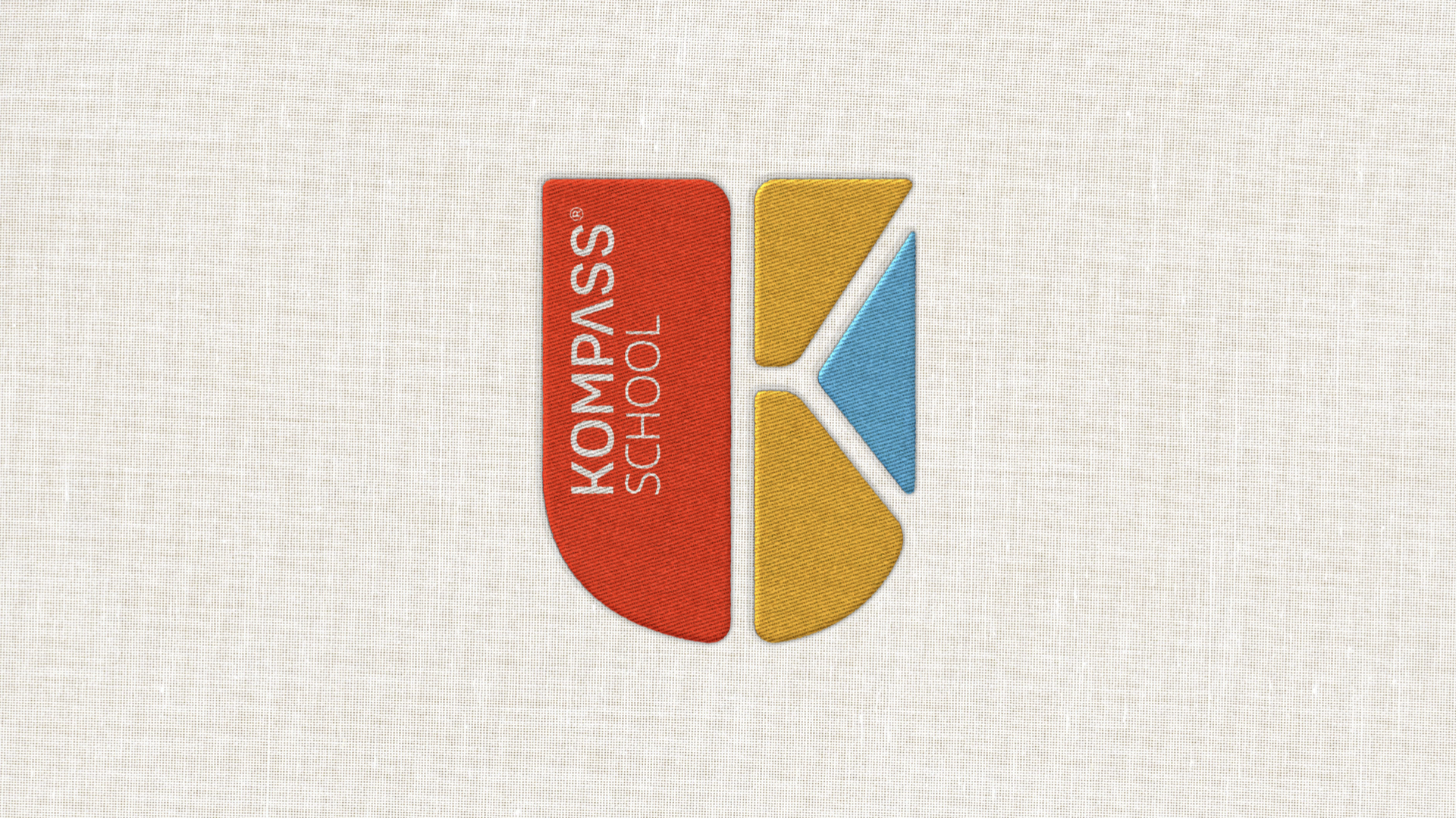
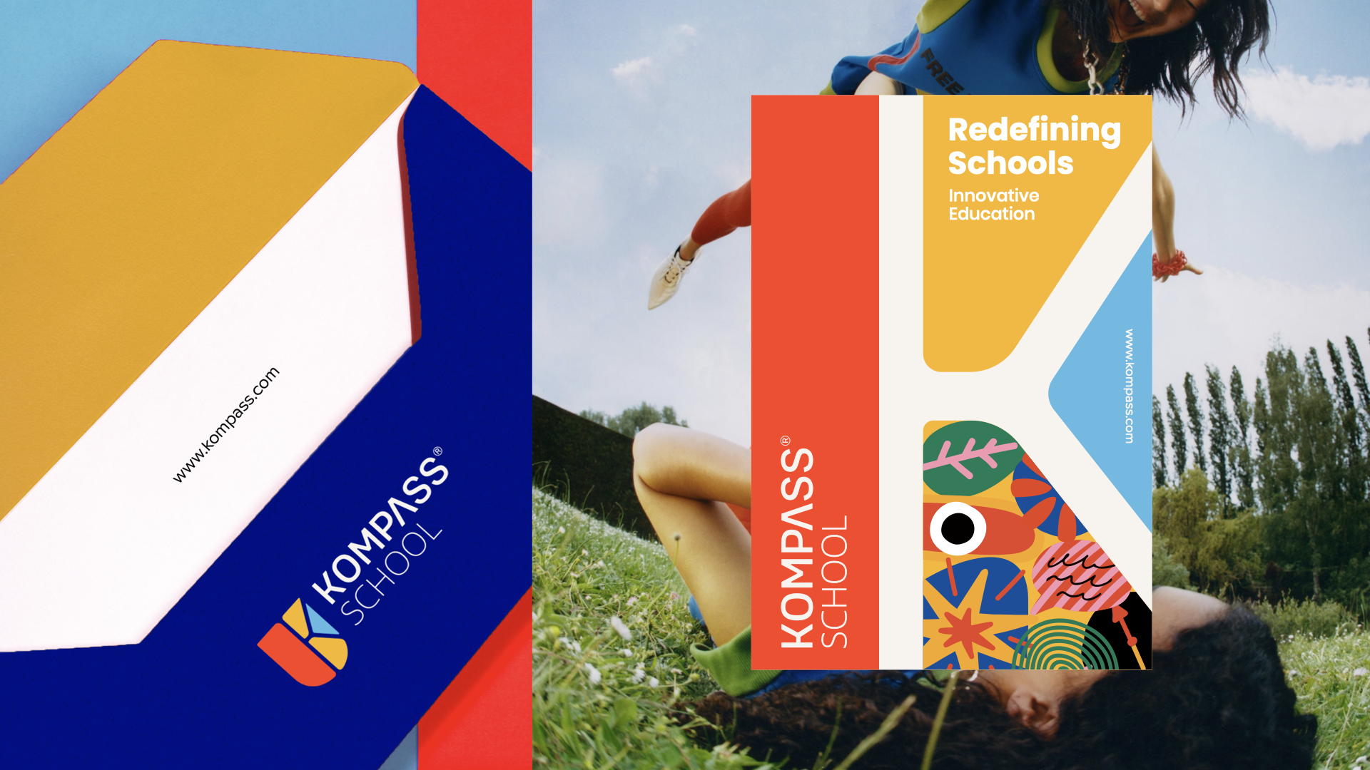
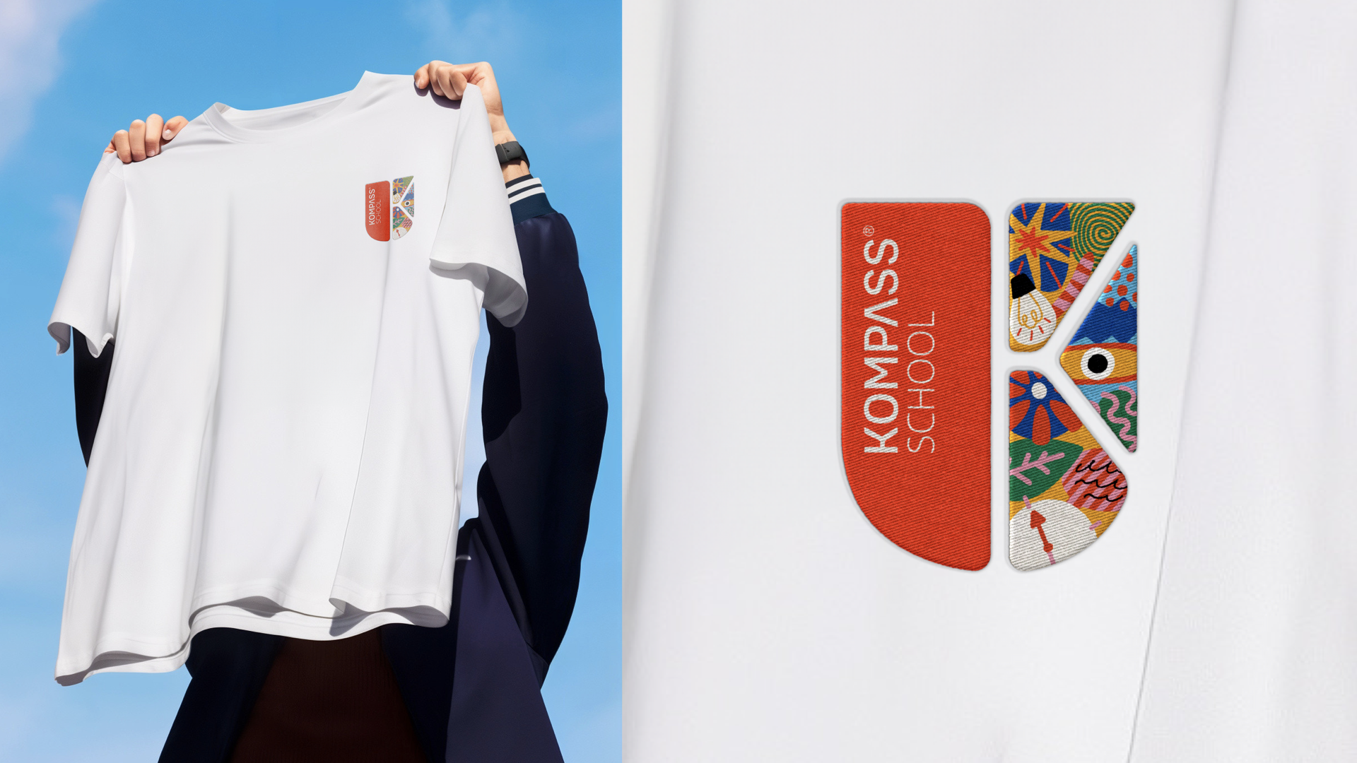
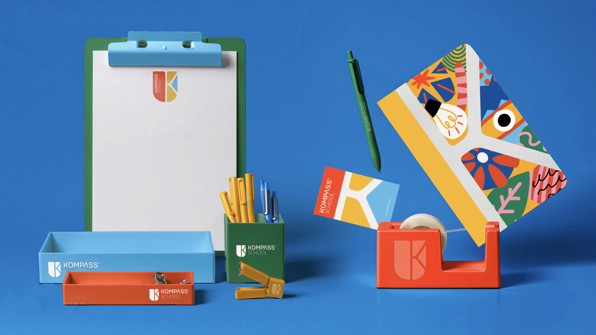
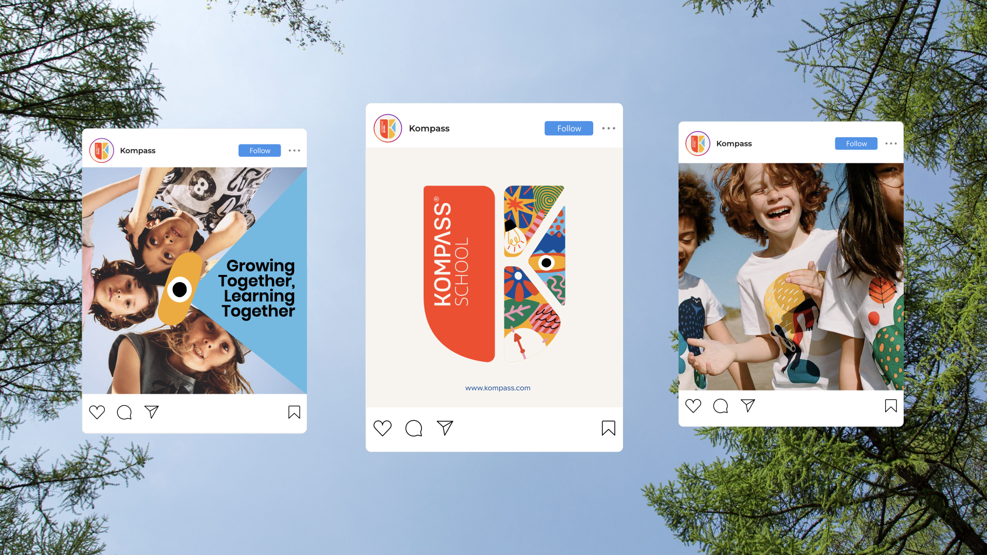
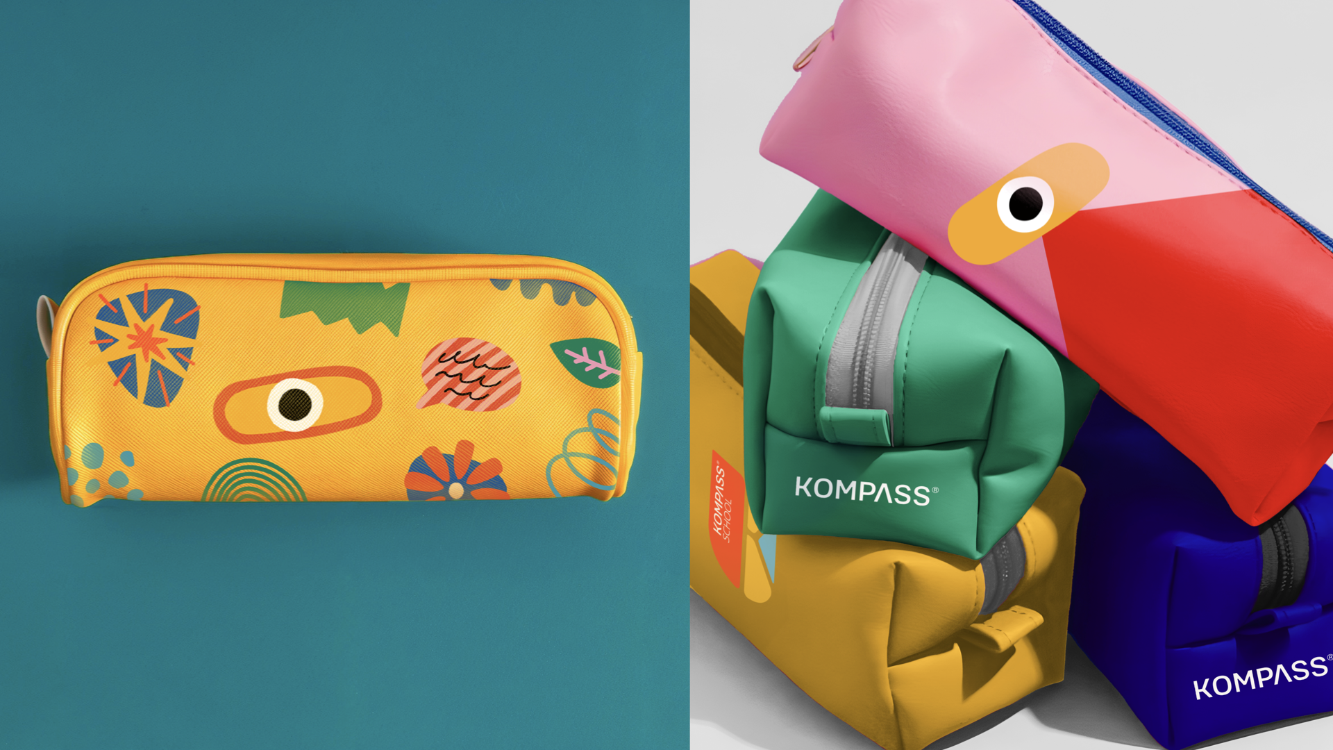
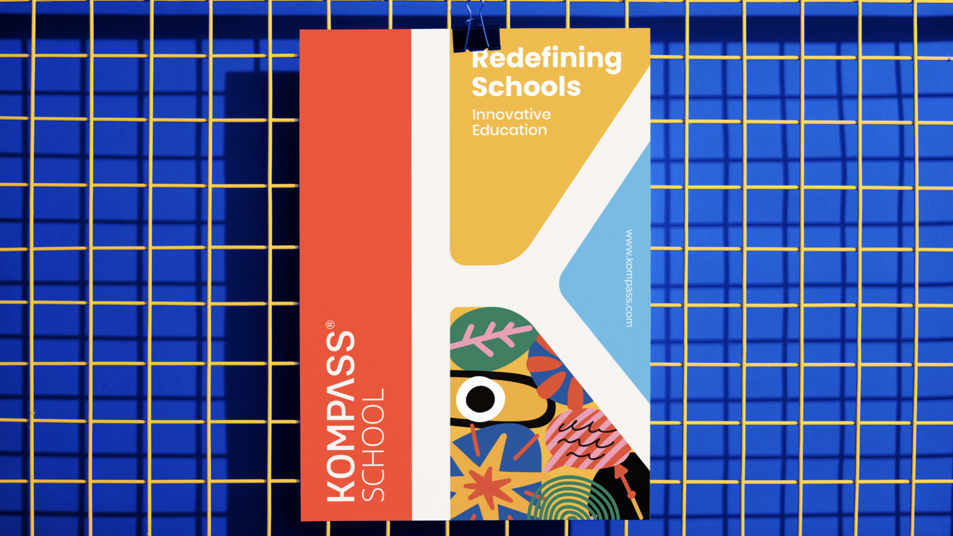
The Kompass brand identity centers around the school's core values, bringing them to life through a dynamic logo, vibrant color palette, and evolving visual elements. The logo combines a bold wordmark with a versatile emblem, where cutouts form the letter ‘K’ to symbolize unity and diversity. A two-tiered color palette reflects the school's youthful energy while adapting to students’ stages of growth—starting with bright, primary colors and transitioning to more refined tones. The visual identity is further enhanced by illustrations that evolve with each grade level, portraying key values like passion, responsibility, and proactivity in a way that grows alongside the students, ensuring a consistent yet flexible brand presence.